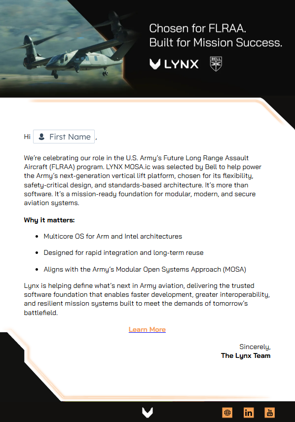
Project Highlight
Lynx Rebrand
As Lynx entered a new chapter, driven by key acquisitions and a sharpened focus on aerospace and defense, I was selected to lead the company’s rebrand as in-house Creative Director. Partnering with an external agency, I oversaw every phase of the process, from brand audit to rollout, ensuring the new identity honored our legacy while projecting a bold, mission-driven future.
I worked cross-functionally to assess the existing brand, evaluate the integration of three acquired companies, and define a unified direction. Collaborating with leadership, I helped shape the brand’s strategic foundation, refining our voice, values, and positioning around the new tagline: Seize the Edge.
Logo Development
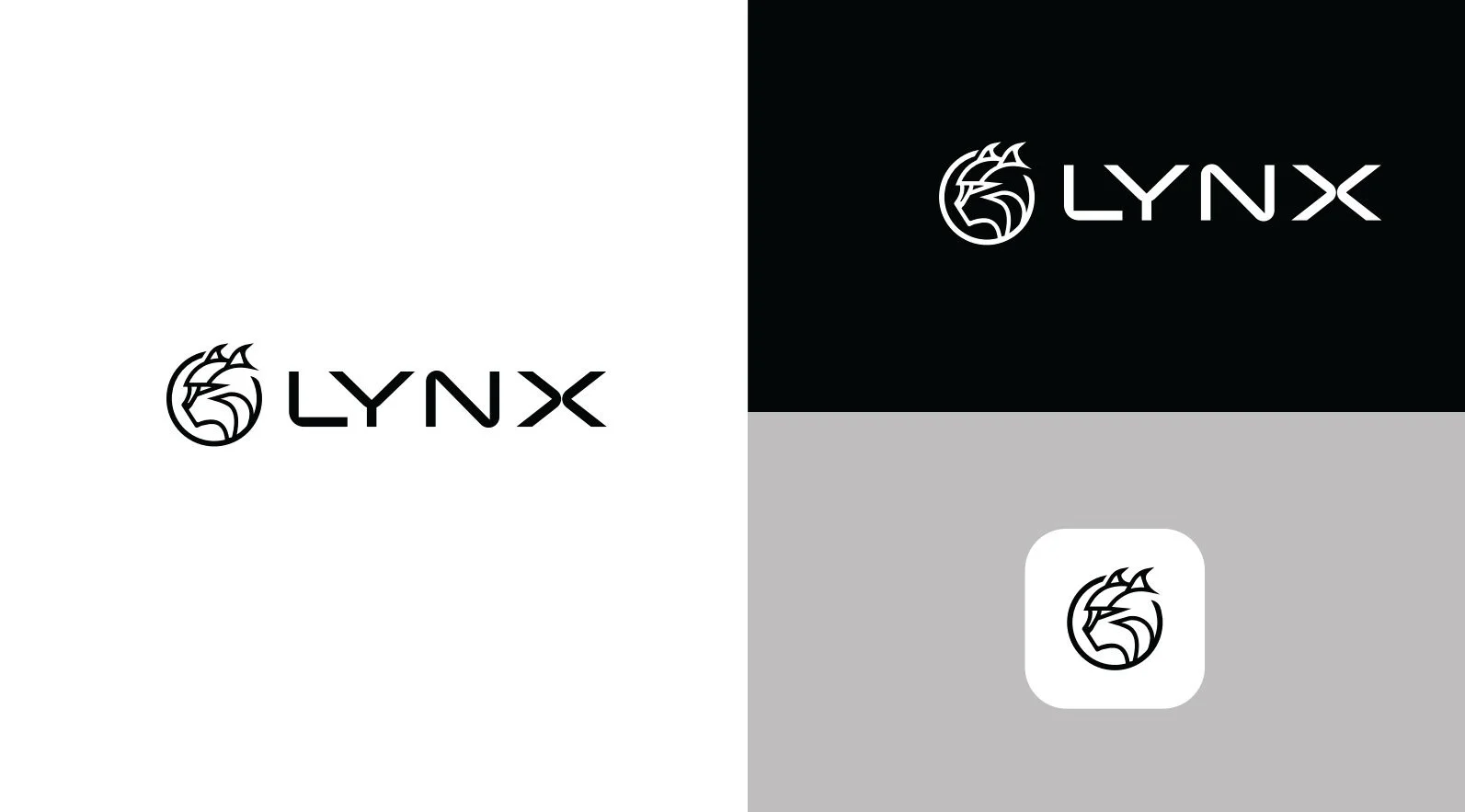
This rebrand effors began at the foundational level: the logo. We needed a mark that captured the core values of security, agility, and innovation while reflecting the new defense-forward positioning. The result is a symbol that evokes a lynx head, sharp, symmetrical, and abstract. It feels tactical, futuristic, and bold, just like the platforms Lynx builds. The hard edges and clean lines nod to the precision and strength our tagline evokes: Seize the Edge.
-
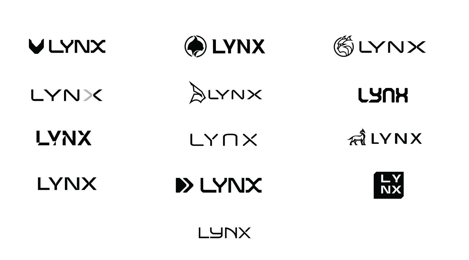
The first image below showcases an early round of logo exploration developed in collaboration with a design agency. As the in-house Art Director, I defined the brand vision and creative direction, ensuring each concept aligned with our core attributes of strength, simplicity, and momentum. These initial studies helped us establish a visual foundation and set the tone for what the Lynx identity would become.
-
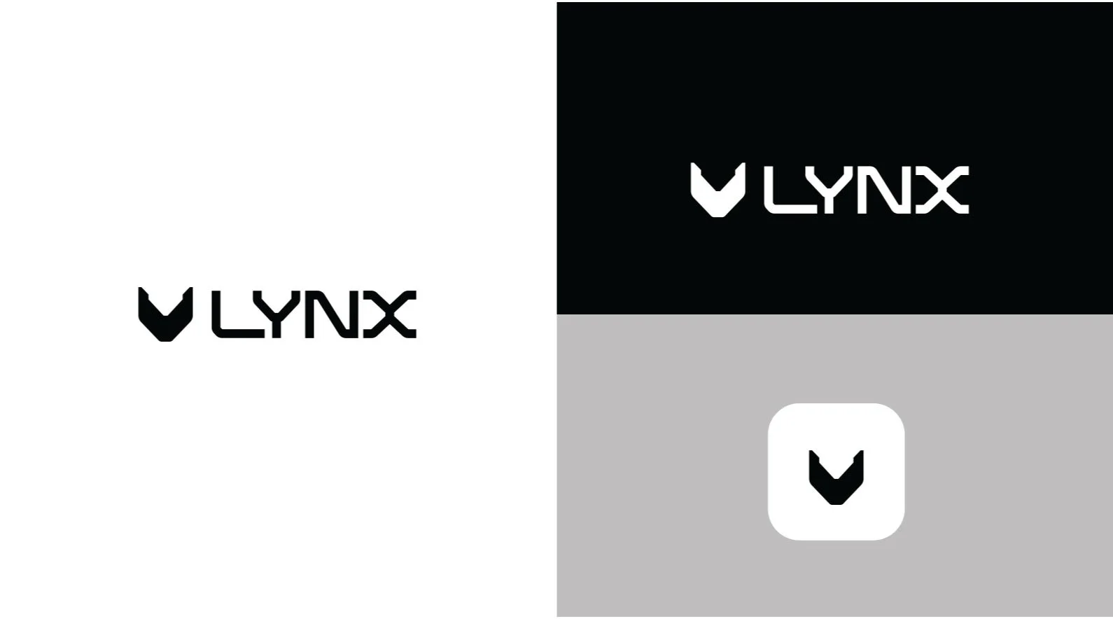
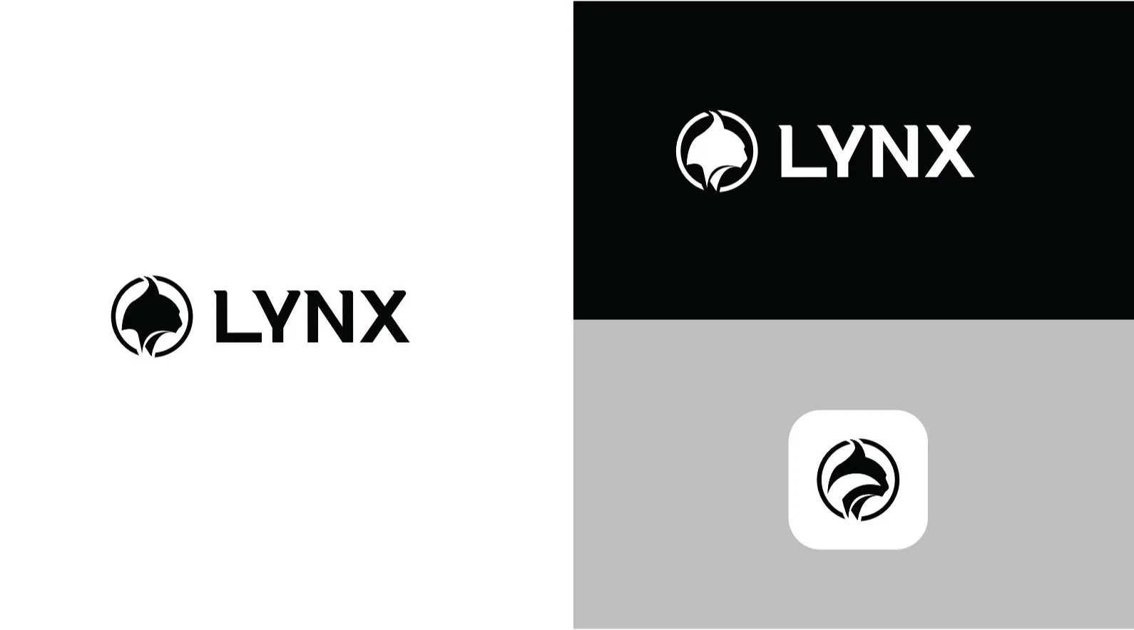
We narrowed our focus to three strong contenders, each building on the themes we’d established. But there were challenges. One logo resonated powerfully: visually sharp, memorable, but the typography felt too close to another well-known brand. We had to pivot. That moment sparked deeper refinement: evolving the type to feel uniquely ours, while ensuring the lynx icon felt woven into the letterforms.
-
Before finalizing the logo, we opened the process to the broader Lynx team, polling employees across departments including engineering, sales, marketing, HR, customer success, legal, product, and executive leadership. Many of these individuals have represented the Lynx brand for years, some since its founding over three decades ago.
We felt it was essential to include their voices in this decision. These are the people who speak for the brand every day: in the field, in boardrooms, and with our customers. Their perspectives provided valuable insight into what felt true to the company’s legacy, and what aligned with our future.
The feedback surfaced nuances that helped us refine both the symbol and the type.
-
The final version brought it all together: a clean, angular symbol paired with customized typography that felt modern, resilient, and unmistakably Lynx. Every element, from spacing to shape to contrast was intentional, resulting in a brandmark that now leads with confidence.

Internal Buy-In
Recognizing the deep roots many team members have with the Lynx brand, I led a company-wide logo feedback initiative engaging employees across engineering, sales, marketing, HR, product, and the executive team. This inclusive step ensured the new identity felt authentic to those who have represented Lynx for 1 to 30+ years.

Color Palette
With the logo direction in place, the next foundational element was color. We needed a palette that would speak to both our aerospace and defense focus and our commercial roots, something that felt grounded, modern, and distinctly Lynx. The result is a strategic blend of bold neutrals and mission-specific accents.
Black and dark gray serve as our core tones, evoking confidence, authority, and technical rigor. These colors anchor the brand visually and signal seriousness and stability. For accents, we introduced orange and blue, each tied to a key audience: orange for aerospace and defense, where urgency and precision are critical, and blue for commercial markets, where clarity, trust, and future-facing innovation take center stage.
Every color had to work across digital and physical environments, feel cohesive alongside our logo, and reinforce our positioning at the edge: bold, focused, and always moving forward.


Typography
I directed the selection of brand typefaces that would strike the right balance between technical precision and modern clarity. We chose fonts that were legible, flexible across platforms, and visually aligned with our identity, allowing us to communicate with confidence across both aerospace/defense and commercial audiences. Typography played a critical role in establishing hierarchy, tone, and brand personality across all touchpoints.


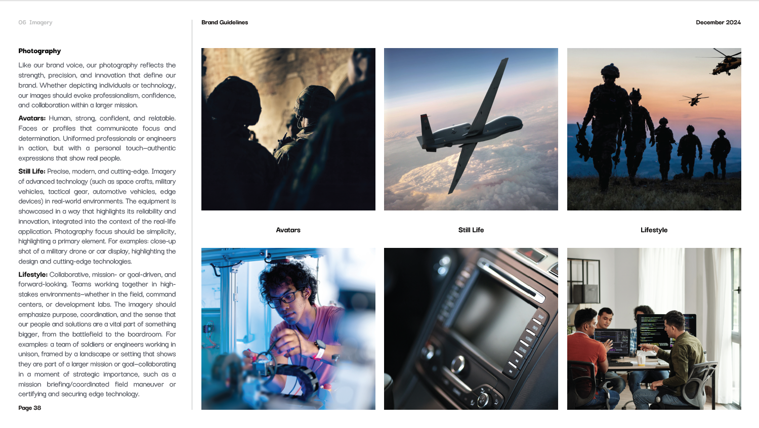
Imagery
I helped develop a cohesive visual system that extended beyond the logo, introducing vector linework, masking treatments, and iconography inspired by the geometry of the lynx symbol. These elements created a distinctive, ownable design language that reinforced our brand values: resilience, structure, and innovation. The system was built to be modular, scalable, and easily applied across digital, print, and environmental media.


Brand Guidelines
I worked with the agency to finalize a detailed brand guideline system, ensuring the identity was crystal clear. From logo usage and color application to tone of voice and digital treatments, the guidelines serve as a toolkit for consistency and creativity.


Rollout and Internal Enablement
I helped oversee the brand launch across digital and internal channels, aligning website updates, product visuals, presentation templates, and social content. I also supported enablement efforts, making sure teams were trained on how to use the new system confidently and consistently.


Application
With the brand system in place, I oversaw the rollout of the new identity across a wide range of touchpoints ensuring consistency, clarity, and impact at every level of communication. From digital experiences to sales enablement tools, every piece was designed to reinforce our positioning and bring the Lynx brand to life.
This section showcases how the brand was applied across real-world materials, including:
Website & Landing Pages
Digital Ads & Social Media
Datasheets & One-Pagers
Business Cards & Stationery
PowerPoint Templates